Historically, Apple has done a great job at iterating the iPhone hardware, causing a new device to come out every year, mostly with new functionality and features. The same could be applied to the iOS software side. With iOS 11 anticipated to be announced at the Worldwide Developers Conference this year, could the company go above and beyond what it has done in the past and revamp the experience of the Home Screen completely?
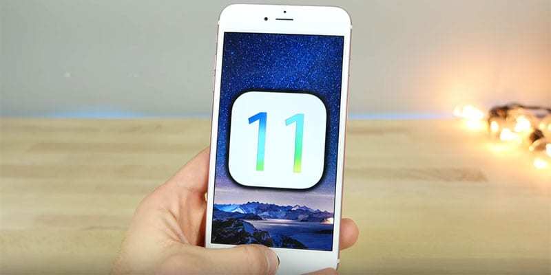
iOS 11 Concept and Expected features
There are high hopes from Matt Birchler, and he has shared what his vision looks like with iOS 11 Home screen concept as well as how it could possibly function.
Matt previously placed his vision for the iOS’s future into reality by redesigning what the Lock Screen for iOS 11 should be like, and has now placed his focus on iOS’s legendary Home screen. He makes a lot of suggestions that will resonate with a lot of you out there.
For starters, he thinks that iOS 11 should be used by Apple to break the norm of enabling app icons to be positioned in fixed grid on the Home Screen. That would enable users to place app icons wherever they feel like on the phone’s display, a feature that jailbreak users are already taking advantage of.
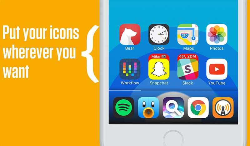
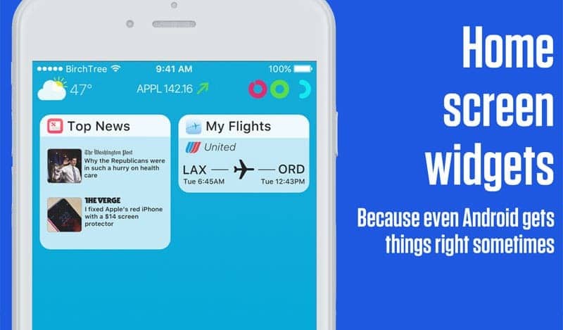
Apart from the subjective movement, a version of iOS with capable widgets and more powerful ones that extend beyond the device’s Today screen are imagined by the developer, along with rich notifications that contain greater information with UI capabilities.
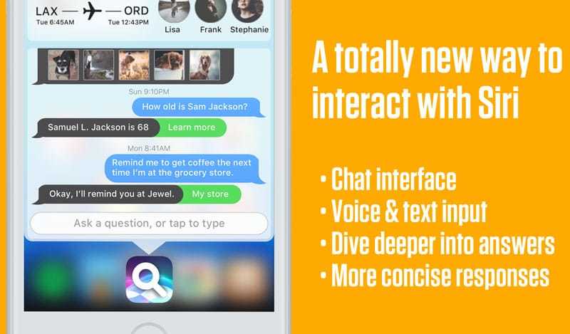
Better Siri integration which could lead the race for AI in the world of digital assistants is also expected in the Apple’s new IOS 11 operating system.
Expectedly, iOS users would welcome all those things, but it could be this idea of Complications that defines the ultimate concept:
When Apple released the Apple Watch in 2015 I figured it was only a matter of time before they brought complications to iOS as well. It’s been 2 years and there has been no movement in this space, but I hold out hope.
In this mockup, complications would be configured just how they are on the Apple Watch, and you would be able to choose between having 3 small complications, or one large (wide) complication on the top of your home screen.
These all have realtime data that’s relevant to me, and this would go a long way to making the home screen more than just a simple app launcher.
Top 30 Expected features in iOS 11
App icons that give out more user-focused data and details is a great idea, but would Apple really be interested in offering this? Perhaps, but not in the short term.




![30 Best Cydia Repo Sources For iOS 16/15/14 Jailbreak [2024] best cydia sources 2020](https://cdn.unlockboot.com/wp-content/uploads/2020/06/cydia-sources-13-100x70.jpg)